Diverda Sans
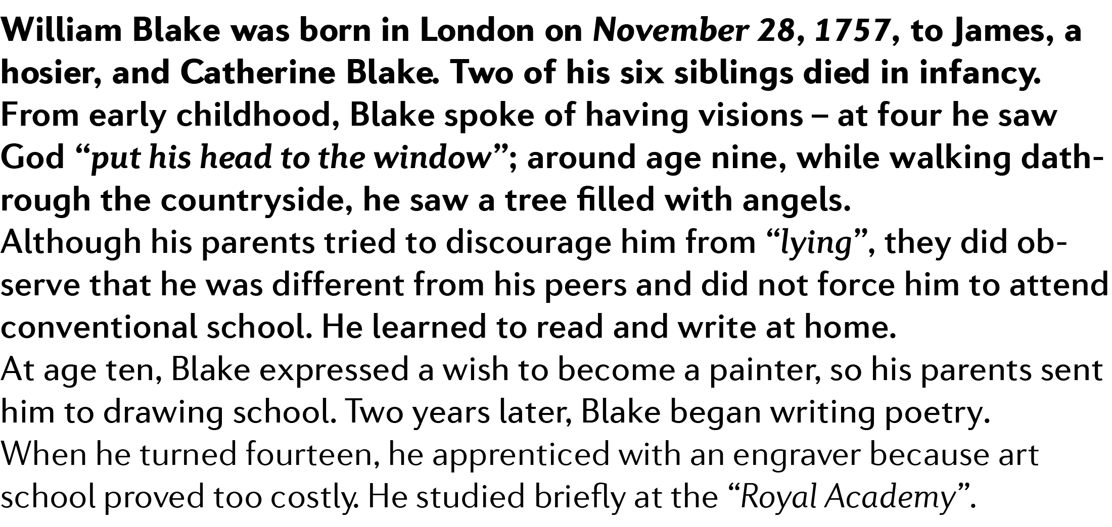
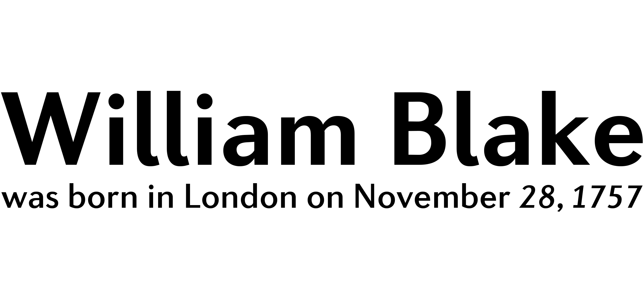
Diverda™ is a geometric type family that is free of ornamentation. The x-heights are low, and the differences between curved, square, and triangular elements is very clear. Like the more calligraphic typefaces of the past, Diverda´s strokes exhibit contrast that is inspired by movements of the pen on paper; down strokes are heavier than up strokes. The family contains both slab serif and sans serif styles; the sans serifs form the basis of the whole design.
The possible applications for the Diverda family are endless, but the typefaces are well suited for use in magazines and for the advertising of cultural products, fashion, design, and architecture. Because of its 20 different individual styles or weights, Lanz´s design is also a good fit for Corporate Identity solutions.
Showing all 11 results
-
Diverda Sans Family Pack
Font Tester -
Diverda Sans Light
Font Tester -
Diverda Sans Light Italic
Font Tester -
Diverda Sans Regular
Font Tester -
Diverda Sans Italic
Font Tester -
Diverda Sans Medium
Font Tester -
Diverda Sans Medium Italic
Font Tester -
Diverda Sans Bold
Font Tester -
Diverda Sans Bold Italic
Font Tester -
Diverda Sans Black
Font Tester -
Diverda Sans Black Italic
Font Tester


